There are seven key elements in our effective presentation design guide for PowerPoint. No one should underestimate the importance of an effective PowerPoint design as it can impact how we deliver our information or knowledge, as well as how effectively our audiences receive them.
Quite often, we have encountered poorly designed PowerPoint presentations that were either ordinary, boring, cluttered or distracting. Some were even barely visible. But, how do we ensure we avoid such mistakes?
First of all, get familiar with the key elements in our effective presentation design guide. Then implement them step-by-step. This will help you eliminate the many pitfalls mentioned earlier when designing your PowerPoint presentation. By crafting your presentation methodically, you will also reduce the need to keep revising your slides.
Effective Presentation Design - The Seven Key Elements
The seven key elements for an effective presentation design for PowerPoint are explained below. They are:
- Template and Slide Layout
- Slide Design
- Fonts and Colours
- Animation, Transition and Sound Effects
- Image
- Presenting
- Compatibility of Equipment
1. Template and Slide Layout
- Use the PowerPoint slide master feature to create a consistent and simple design template. You may want to use custom-made or third-party templates instead of the ones supplied by Microsoft that have been over-used, which could make your presentation looks dated. To better represent your company, you may consider creating a template that contains your corporate logo and colours. This is one of the most basic presentation design element that even experienced presenters have often overlooked.
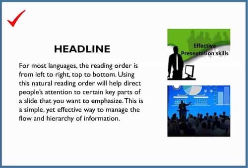
- Use the proper layout – For most languages, the reading order is from left to right, top to bottom. Using this natural reading order will help direct people’s attention to certain key parts of a slide that you want to emphasize. This is a simple, yet effective presentation design strategy to manage the flow and hierarchy of information.
2. Slide Design
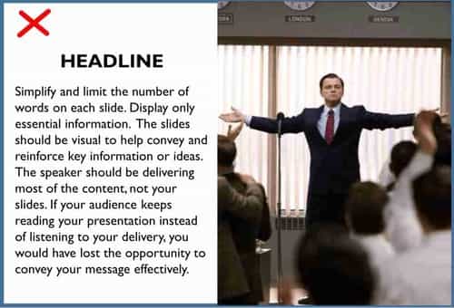
- Simplify and limit the number of words on each slide. Check for spelling and grammar errors. Display only essential information. The slides should be visual to help convey and reinforce key information or ideas. The speaker should be delivering most of the content, not your slides. If your audience keeps reading your presentation instead of listening to you, the opportunity to convey your message effectively will be lost.
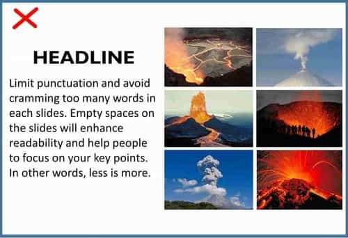
- Limit punctuation and avoid cramming too many words in each slide. As a guide, each slide should not contains more than five lines. Empty spaces on the slides will enhance readability and help people to focus on your key points. In other words, less is more.
3. Fonts and Colours
- Be consistent with the use of font(s), colours, and background. The use of too many colours can be distracting.
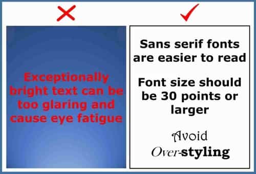
- Use contrasting colours for text and background. Dark text on white background or Light text on a dark background is most effective. Patterned backgrounds can reduce readability of text. Exceptionally bright text can be too glaring and cause eye fatigue. Similarly, intense gradients can make the text less visible. So, use both sparingly. If you are presenting for your brand or company, check what are the corporate colours and the guidelines for using them. This will help you to align your presentation design with your company’s identity and style.
- Use sans serif fonts. Different fonts can evoke different emotions. Traditionally, serif fonts such as Times New Roman, Garamond and Bookman are best suited for printing, while sans serif fonts such as Helvetica, Tahoma and Verdana are preferred for screen presentation as they are easier to read. It is advisable to stick with one font, or choose two at the most, to give your presentation a consistent feel.
- Font size should be 30 point or larger. Many experts agree that this is the minimum font size to use. In fact, some even suggested larger font sizes. Not only does it ensure that your text is readable, it also forces you to include only the most important points of your message and explain them efficiently since space is limited.
- Use larger fonts to indicate importance and avoid abbreviations and acronyms as not everyone is familiar with them.
- Simplicity is key to an effective presentation design for PowerPoint. Use simple techniques like bolding, italicising or changing the colour of the words to help draw attention. But use them sparingly and avoid over-styling as it can make your presentation looks distracting and messy. Three of the easiest and most effective ways to draw attention to text are: bold, italics, or a change in colour. Our eyes are naturally drawn to things that stand out, but use it sparingly.
4. Animation, Transition and Sound Effect
- Avoid the over-use of flashy animations and transitions, as well as sound effects. These features may seem impressive at first, but they can become distracting and tiresome. By all means be creative, but don’t get too elaborate as it could spoil your overall presentation design.
- Do not include too many different animation into every slides as it can make your presentation look confusing. It could also make it difficult for your audience to focus on the key information in your slides.
5. Images
- Use relevant images that reinforce your message. Ensure that your pictures are of high resolution as far as possible so that they remains sharp when projected on a larger screen.
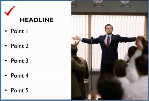
- Use images of appropriate size so that your audience can see them clearly. Use one or two large images of the same size rather than several small images. Size does matter!
- When using charts or graphical images, use minimal text and label them clearly. A graphical image should relate to and enhance the topic you are talking about.
- Avoid clipart. They have been so commonly used that they are included in PowerPoint by default. But they have become such a “visual cliché”, making your presentation look tired and dated.
6. Presenting
- Time your presentation. Maximise the time allotted to you in order not to miss out on any key information. But at the same tie, do not cramp too much information within a limited timeframe. Make sure you highlight your most important information.
- Rehearse your presentation and ensure your sides are clear from the back row. Adjust the lighting and room setup for optimal visual and audio delivery.
- Familiarise yourself with the presentation and learn how to navigate it. Often, audiences will ask to see the previous slides again or you may need to bring them back to an earlier slide to clarify or reinforce some information.
- Inform your audience that copies of the slides will be distributed at the end of the presentation, if they require them. This will keep their focus on you. Avoid giving the slides at the start as your audience could end up reading them instead of listening to you. A good and effective presentation design should create some suspense that engages the audience. If the audience can read everything you will be talking about, that element will be lost.
- Limit the number of slides. You should be the main source of information, not your slides, although they play an important supporting role. Also, presenters who “flip” their slides constantly are likely to lose their audience. A good rule of thumb is one slide per minute. If sound effects or a video is used, wait until they have finished before talking.
- Speak to the audience, not read from the slides. Make eye contact to draw their attention to you. Often, presenters face away from their audiences and this will negatively affect their ability to engage them.
- Use a wireless presenter (see picture below) to help you control the slides. It also allows you to move around and interact with your audience.
- Give a brief overview of your presentation at the start. Then present the information. Finally review important points to reinforce your audience’s memory, especially in a long presentation.
7. Compatibility of Equipment
The last element in our effective presentation design guide is about the slide size and whether they are compatible to the projector used in the presentation venue. Quite often, many people have overlooked this issue and this could result in dire consequences.
- Check out the equipment and screen size used in your presentation venue before designing your PowerPoint presentation. The latest default standard, starting from PowerPoint 2013 onward, is the 16:9 widescreen aspect ratio. The previous standard is 4:3. If you project your PowerPoint presentation designed in the 16:9 aspect ratio onto a 4:3 screen, black bars on the top and bottom of the slide will appear. This is because the slides do not fill the entire height. Vice versa, if your PowerPoint presentation is designed in the 4:3 ratio but projected on a 16:9 screen, black bars will appear on both the left and right side of your slides. This is illustrated in the pictures below. Exercise due diligence to maximize the impact of your presentation. More information about this can be found on "What PowerPoint Slide Size to Use?" and "How to Change PowerPoint Aspect Ratio"
- Do a test run before the actual event. Adjust and fine-tune your presentation to ensure the equipment are all functioning properly.
Next time, when you need to design a PowerPoint presentation, remember that simplicity is key and less is more. By implementing the key elements in our PowerPoint guide, you will have an effective presentation design.
However, if you want to raise the standard of your presentation to the next level, knowing what constitutes an effective presentation design is just the beginning. You also need PowerPoint mastery to take advantage of its advanced features, such as 3D Morph. Check out the video below to learn how such advanced PowerPoint techniques can truly transform your presentation.
You can also find more examples in our PowerPoint Design Ideas.
If you feel that such advanced presentation design techniques are too complex or too time-consuming to master, why not let PowerPoint Creatives Singapore assist you in this important task. We offer very affordable PowerPoint presentation services that will not only help to convey your messages effectively, but also captivate your audience with creative visuals. We also provide various PowerPoint design options to cater to different needs and budgets. And to learn more about our PowerPoint design process, please click here.
In addition, we provide infographic and cinemagraph design services that can further enhance your presentation. Or if you require cost-effective videos to promote your products or services, please get in touch with us here.
We hope the above PowerPoint guide will help you in your presentation design. For those working in educational institutions, the Education PowerPoint Design will provide further insights into what students like or dislike about their lecturers' PowerPoint presentations.
This effective presentation design guide has been derived from the findings of Dr Laura Edelman and Dr Kathleen Harring from Muhlenberg College in Pennsylvania where they carried out a survey on students who attended their professors' lectures.
You may also want to check out the Eight Common PowerPoint Presentation Mistakes to avoid before designing your presentation. You may also wish to download our free PowerPoint diagrams to help with your slides design.
If you are looking for public speaking techniques, please refer to Presentation Techniques, Public Speaking & Communication Skills.

